Regression toward the mean
Regression toward the mean is the term for the tendency of extreme samples drawn from a probability distribution to be followed by {{c1::future samples closer to the mean}}.
Example
The idea is often presented using an example involving students taking exams, and the fact that each test score is a combination of that student’s (deterministic) skill and some (probabilistic) luck. The students then take a second, similar test, and we observe the correlation between scores across tests for each student. Here we observe that those students whose test scores were made up by a large luck component (either good or bad) in the first exam likely had a second exam score with a less extreme luck component. That is, the second exam scores are impacted by a regression toward the mean of the noisy luck distribution (assumed to be 0), better representing the fixed skill underneath. Note that it is just as likely that there will be scores on the second exam with extreme luck components, but it is less likely that those scores will be from students whose first exam scores were also extremely lucky.
A brief excerpt that touches on the idea from the example:
Our performance always varies around some average true performance. Extreme performance tends to get less extreme the next time. Why? Testing measurements can never be exact. All measurements are made up of one true part and one random error part. When the measurements are extreme, they are likely to be partly caused by chance. Chance is likely to contribute less on the second time we measure performance.
If we switch from one way of doing something to another merely because we are unsuccessful, it’s very likely that we do better the next time even if the new way of doing something is equal or worse.
– Peter Bevelin (source)
In short, among a population of individuals whose performance is being evaluated at a given task, those that perform at the highest level are likely those with high skill and a high degree of luck during that performance. When re-evaluating these individuals during a new observation period, those that were in the highest echelon previously will on average perform worse due to less extreme draws of luck. This highlights RTM just at the upper end of performers in this example, but one can imagine how it applies to varying degrees across all samples. This is usually easy to see with scatterplots of real-world processes, as shown below.
Scatterplots
To highlight the effects of RTM a little further, consider an example where we have data on the height of fathers and their sons. One might reasonably expect that there’s at least a moderate linear relationship between these two variables, and a common task might be to find the least squares regression line for our samples. Suppose plotting these data produced the scatterplot (source) seen below:
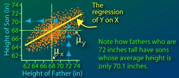
Here we notice that the marginal distribution of the sons’ heights has less variance than the distribution of fathers’ heights. As a result, the regression line has a slope of less than (it’s less steep than ). Note that these marginal distributions also have the same mean
Similar to the student exam example, this can be explained by a regression toward the mean. A son’s height can be viewed as a linear function of his father’s height combined with some noise. For a given value of , the associated values have a mean closer to (mean of all values) than has to . An example of this is given in text in the figure above.
Those fathers who are extremely tall or short likely had some extreme luck to end up with such a height. While a lot can be said about their son’s height from their own, on average the sons of fathers at the extreme are less likely to be as extreme as their own fathers. The sons’ heights regress toward the mean as a result.
Personal remarks
A couple of personal remarks as I was reading up on this and struggling to understand its importance:
This idea didn’t seem nearly as salient as a lot of articles made it out to be, especially in the common/implicitly assumed context of drawing from normal-ish distributions that are symmetric and have most of the density centered around the mean. It seems that yes, when we get extreme samples, there are just that: extreme. We will intuitively not observe such samples as often as those values under a higher density region of the distribution’s domain, which as assumed is mostly allocated near the mean. In this sense the discussion seemed like nothing more than one of the most basic statements that could be made about statistical sampling.
However, the value in thinking about the idea became more apparent in the context of concrete examples, and the fact that it can result in counterintuitive conclusions in real world experiments. I think the examples above highlight this pretty well, and the way it can explain the common shape of scatterplots (and the underlying data of course) was something I don’t think I’ve previously given much thought.
Regression away from mean: enumerates the set of conditions under which RTM doesn’t really hold, and instead may trend away from the mean. Interesting read with a lot of extra details.